Gothic fonts are used in published materials for musicians and bands to connote a connection with the medieval mores and block character components of the Middle Ages. With their sharp diagonals, refined serifs and suggested (but rarely manifest) concavity, gothic fonts paradoxically invoke both the regality of stately monarchy and the bloody glory of divine violence; that is to say, with gothic fonts a musician may portray him- or herself as sovereign leader, Arthurian gangsta or, in a select few cases, both.
The imperial ornateness of the gothic font lends a sense of weight and social fixedness to the name of an artist or object. Its implicative qualities work immediately on the phrase, elevating it to a standard of permanence and institution that contemporary sans-serif and downscaled fonts cannot provide. Displayed in the most momentous of gothic fonts, any phrase can be transported from the temporal to the immortal:


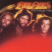
The gothic font has proven surprisingly versatile in range of purpose. It has given authority and royalty to pop music works that appear, on first glance, slight on thematic grandeur:

The gothic font can often be used in collaboration with threatening countenance to imply severity and finality of a pending act of smackdown:

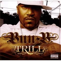
Gothic fonts are particularly effective when combining royalty and severity, in their deployment as symbols of ominous physical harm and dominant sovereignty:

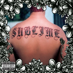
Finally, gothic fonts yield yet another depth of mass when they are permanently seared onto flesh:

Gothic fonts have been known to get into very public, physical altercations with more modern fonts. Despite their chronic arthritis and use of primitive blunt instruments, gothic fonts almost always prevail in these skirmishes, leaving modern fonts alone to be branded upon technological gadgets and male-oriented anti-perspirants.


1 comment:
I really liked your story. Indeed, I adore Gothic and medieval fonts, so you truly pleased me with the article! Thank you!
Post a Comment